Before to start to create Formula One edits and videos, I was studying graphic design at school. Apart from video-editing I enjoy a lot designing and creating cool logotypes and graphics for all my Formula One documentaries and videos. That’s the reason why I’ve decided to explain all my knowledge in that area mixing with my biggest passion: Formula 1.
In this page you will find content where I’m analyzing and studying how Formula One Teams creates designs and build their brand and visual identity in all areas (car design, social media, website) In this section of the blog you can find video lessons where I analyze some real case study and different branding elements of most of the constructors involved in Formula 1. Also I explain what design techniques they use and what visual and branding strategy every team is implementing in terms of colors, typography, fonts and graphic design elements to communicate and connect with their potential fans, customers and buyers.
The SECRET Behind Formula 1 YouTube THUMBNAILS *Explained | Brand Strategy & Visual identity Example
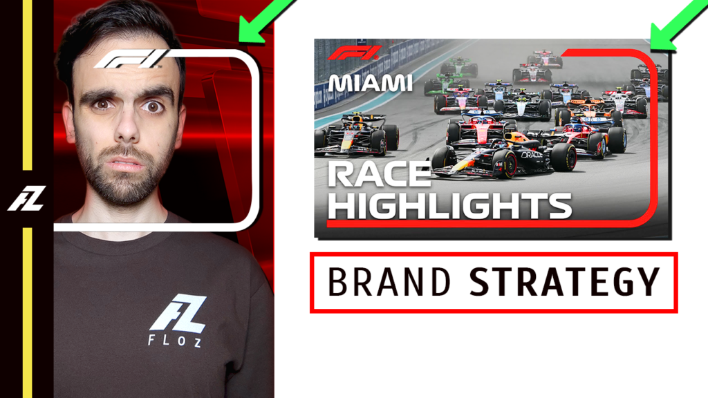
Formula One is following a very interesting brand strategy in it’s designs on the YouTube thumbnails they create in all it’s videos. In this video let’s use this case study to explain the graphic design techniques Formula 1 uses to create a brand visual identity, seeing some examples in it’s YouTube channel, website and mobile app to understand how to create an strong brand identity using some concepts like brand consistency and brand memory identity.
How to DESTROY Visual IDENTITY redesigning Car Livery *by STAKE F1 Team (Case Study)
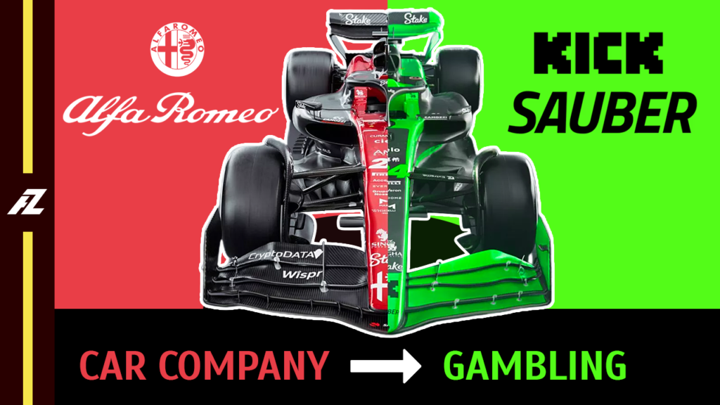
The brand new Steak F1 Team will compite in the 2024 Formula One season after a brand deal with the Formula 1 constructor: Sauber, substituting to Alfa Romeo as a title partner. Steak is a gambling online platform that has very strong connections with the streaming social media platform: Kick. In this video I will analyze how the new graphic design department of Steak F1 Team has to adapt the car to the visual and brand identity of the Steak company, creating a visual strategy that includes different visual elements like color, typography and of course, the car livery, that I will try to design, predicting how it’s gonna be the car colors before the launch on February 5th 2024.
Google Chrome X McLaren F1 (*BRILLIANT Strategy Explained) Brand Identity Case Study
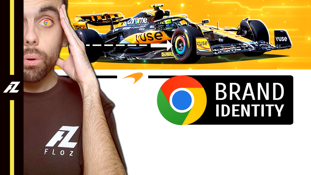
The McLaren Formula One Team and Google are associated since 2022 representing the Google web browser logotype (Google Chrome) in different areas of the chassis of both McLaren cars like engine cover or wheel covers. in this video l gonna explain, in a brand lesson, why the Google Chrome logo integration in the McLaren chassis is one of the best brand identity design strategies in the Formula One world actually, getting in depth of the Google Chrome meaning and the visual identity evolution of it through the years. Finally let’s discover the integration of the Google Chrome logo in the brand new McLaren MCL38 car livery to compite in the 2024 Formula season.
NEW Visual Identity TYPOGRAPHY for MERCEDES F1 Team in Social Media *FONT Experiment
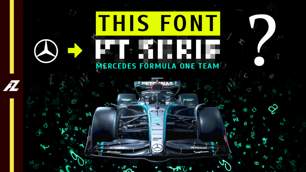
The typography and fonts used by Mercedes Benz and the Mercedes AMG Petronas formula One team are completely different. In this video I gonna explain what is the purpose of typography and why is so important in graphic design to create a very solid brand and visual identity. Finally, let’s discover the results of my experiment: I changed the fonts used by the Mercedes F1 team in their Social Media designs on X (Twitter) Facebook, Instagram, YouTube and it’s own website. In that way we’ll discover if a font that is closer to the visual identity typography used by Mercedes Benz fits better or not for the brand and visual identity typography of the Formula 1 team.
Explaining Why FERRARI SUITS have Yellow-White LINES | Visual Identity System in Branding Design
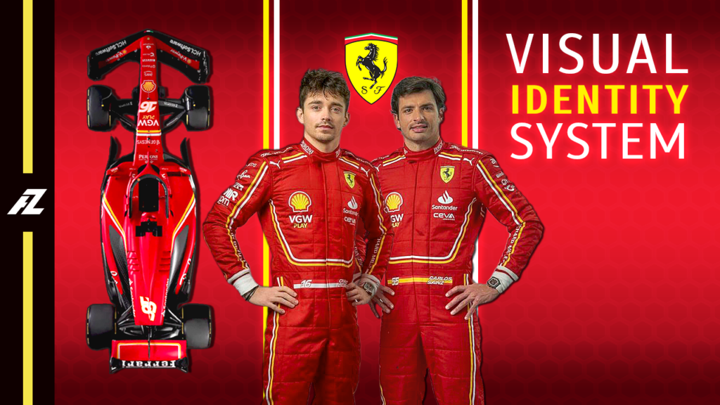
The brand new Ferrari SF24 car livery presented for the Formula One 2024 season is quite different in comparison to the previous year. The graphic designers have decided to make changes in the visual identity system of the brand. This year new lines in white and yellow color covers the car, adding new visual elements to the rest of the products as the merchandising (t-shirts, caps, polo shirts) of the team or the race suits of the drivers Charles Leclerc and Carlos Sainz jr. In this video let’s check the new changes and let’s take this new design as case study and example to learn how works the visual identity inside of a Formula 1 team, responding some questions like: what is the visual identity system? what makes a good visual identity? What components make up a visual identity?
Why DID NOT FERRARI Design a Complete BLUE LIVERY? Case Study: BRAND COLOR Identity *Explained
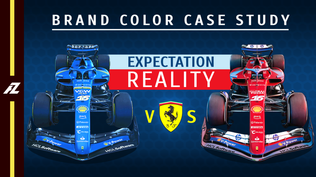
Scuderia Ferrari has designed a new car livery to race in the Formula One Miami Grand Prix to celebrate the new brand deal reach with his new title sponsor: HP. Ferrari has introduced a new color in his brand identity: Blue. But the final livery presented was wide out of the expectations of the Ferrari and Formula 1 fans around the world. People was expecting a similar livery than in 1964, when for some historical circumstances Ferrari race under different colors, using two different blue colors, called them as: Azurro La Plata and Azurro Dino. In this video I going to explain the reasons why Ferrari has not painted his car on full blue.
COLOUR Perception EXPERIMENT: 2024 McLaren F1 Senna Livery | Brand Color Memory Theory *Explained
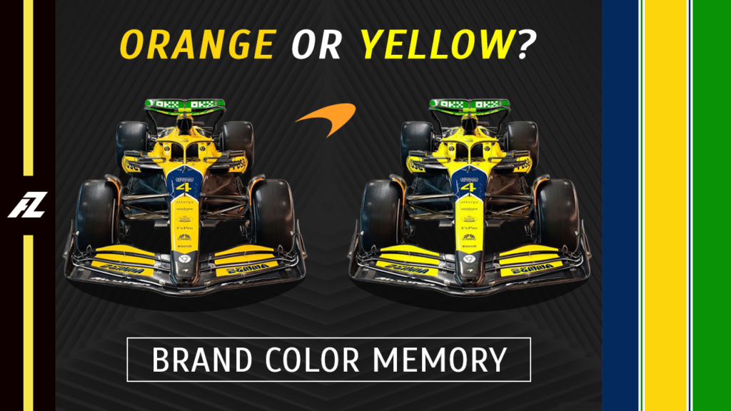
McLaren F1 Team has presented a brand new livery to race in the Formula 1 2024 Monaco Grand Prix. This livery is based in green, dark blue and yellow, that are the colors of the helmet of the three time Formula One World Champion an ex McLaren F1 driver: Ayrton Senna. After seeing for the first time this livery I was not able to see the yellow color as yellow, for me it was some kind of variant of the main color McLaren is using in their F1 cars during this season, the Papaya Orange. In this video I will explain why I was not able to see yellow as yellow introducing some concepts as the brand color color memory and the visual color perception theory.