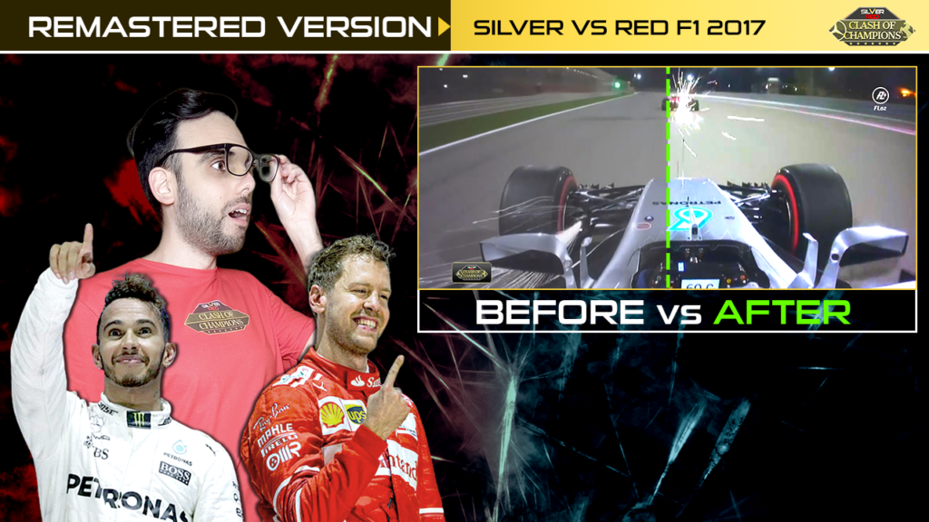
The original logotype of the Formula one documentary Silver vs Red F1 2017 – Clash of Champions: Sebastian Vettel vs Lewis Hamilton had some little differences with the current one. in this video I explain why I decided to make some changes in the original logotype and I will show you the prototype version, that I never published.
MORE DETAILS ABOUT THE REDESIGNING GRAPHIC PROCESS
Dani Lozano made in 2020 the remaster version of his Formula One documentary: Silver vs Red F1 2017 [Clash of Champions] Sebastian vs Lewis Hamilton. In this post Dani explains the changes he made in the video-editing process and in the graphic design style to create a much more professional documentary. *This post is exclusive content for the members of the FLoz Premium tier in the Patreon page of Dani Lozano.
