The Silver War F1 documentary is also well known for its graphics and logotype. The original Silver War F1 logo, first published years ago, has evolved over time. In addition, Dani Lozano (FLoz) created a prototype version before the documentary was released. That version was never made public until today, when it will be revealed for the first time.
PROTOTYPE DESIGN
It’s the first design I made for the thumbnail, the cover image of the documentary The Silver War. I never published it because this version was just the first prototype.There are a lot of different elements. It’s more basic and simple. I’ve evolved as a graphic designer as well. Back in 2016, I had just finished my graphic design studies.
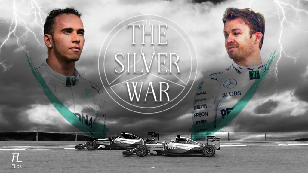
The logo is very simple, as you can see, with the Mercedes logo in the background in white, very, very faint, along with the lettering. The typography is the same, and this is the only thing I haven’t changed. The photos of Hamilton and Rosberg are different as well. They’re almost transparent, with the cloudy background and the lightning bolts behind them.
At the bottom of the picture, you can see the two Mercedes drivers. The cars are the Mercedes cars from the 2015 season, not the 2016 season. This is something I initially thought about changing. I thought, «Hmm… Maybe I should change them.» But the problem was that I couldn’t find a picture that matched this thumbnail design featuring the 2016 cars. I really like this photo, so I decided to keep it.
FINAL DESIGN
If you’re a real veteran and watched my documentary on YouTube, you’ll probably recognize this thumbnail. It’s the original design I uploaded to YouTube with the first version of The Silver War.
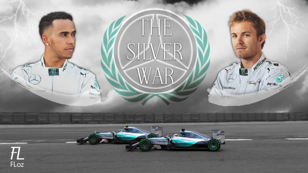
I improved the cloudy background, changed the logo, and added the laurel crown for the first time. The Mercedes logo is a bit shinier, too. The first version was really basic. I also added shadows to the The Silver War lettering. As for the cars, I decided to keep their original colors while making the background black and white. I also changed the photos of Rosberg and Hamilton. Much better, in my opinion, than the previous version.
REMASTERED DESIGN
This is the thumbnail design I made for the remastered version of the documentary launch in 2019, three years after the original version. By then, I had obviously improved a lot as a graphic designer. I knew better techniques for creating and editing images.
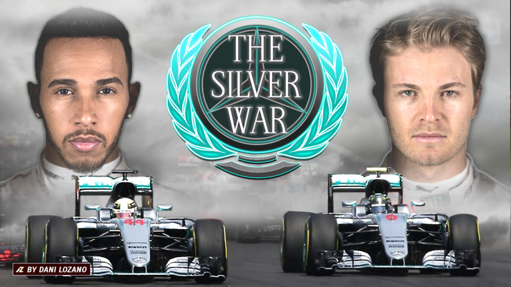
There’s a big improvement, especially in the logo. I dedicated a lot of hours to remastering it. You can see the shine, the 3D textures, the letters, and the shining laurel crown. It’s something you can look at and immediately tell that it’s really professional. Obviously, three years later, I had much more knowledge. I found some great pictures of Rosberg and Hamilton looking directly at the camera.
As for the cars, I would have liked to find a photo similar to the one used in this thumbnail design, but with the cars facing directly forward, at a 100% front view, rather than slightly turned to the right like in this one. Anyway, you can see the difference from the first version to the third:
ULTIMATE EDITION DESIGN
In 2025, I made the final edition of the 2016 Silver War F1 documentary, which I called the Ultimate Edition. Apart from providing a much better visual experience when watching the documentary, I also redesigned the thumbnail, making a few minor changes that gave the design its definitive look and made it the best representation of what the documentary is all about.
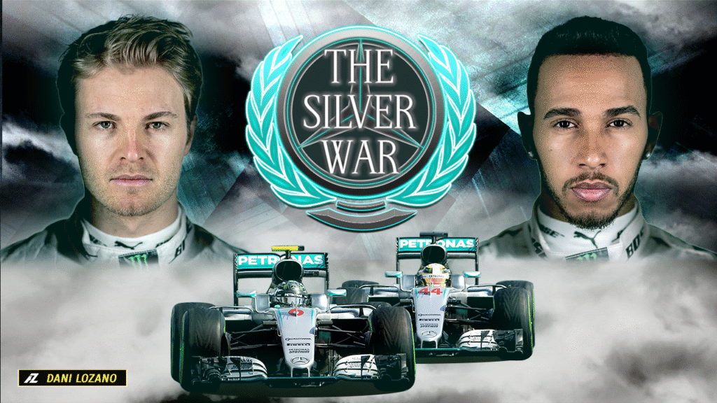
The elements used in this version are almost the same as those in the previous (Remastered) version. I only made the photos of Nico Rosberg and Lewis Hamilton slightly smaller and swapped their positions, with Rosberg now on the left and Hamilton on the right. I made these changes because the photos of the Mercedes cars are new. Rosberg’s car is now on the left, with Hamilton’s car just behind it on the right. This way, the positions of the drivers and their cars match.
The logotype remains the same as in the previous version, but the background is different, featuring metallic textures that match the Silver concept. In addition, the background has a clear green-blue color grading, creating harmony with the overall color palette, represented by the laurel crown and the Petronas green tones of the Mercedes cars.
LOGO COMPARISON

The logotype representing The Silver War F1 documentary has also evolved with every new design. It’s like in life: everyone evolves, in every aspect. As the creator of this documentary, I wanted to improve the overall experience, and graphics play a very important role in that: building and creating the story of The Silver War.